Assignment 1
https://nadiazheng.com/
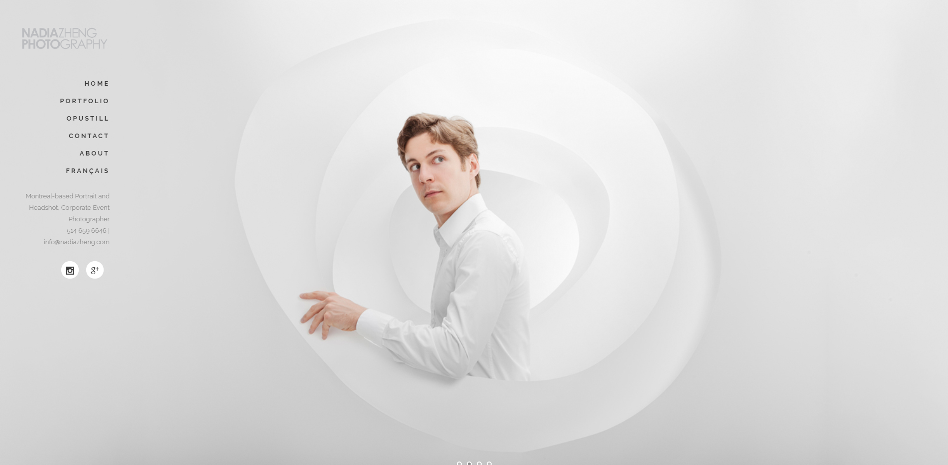
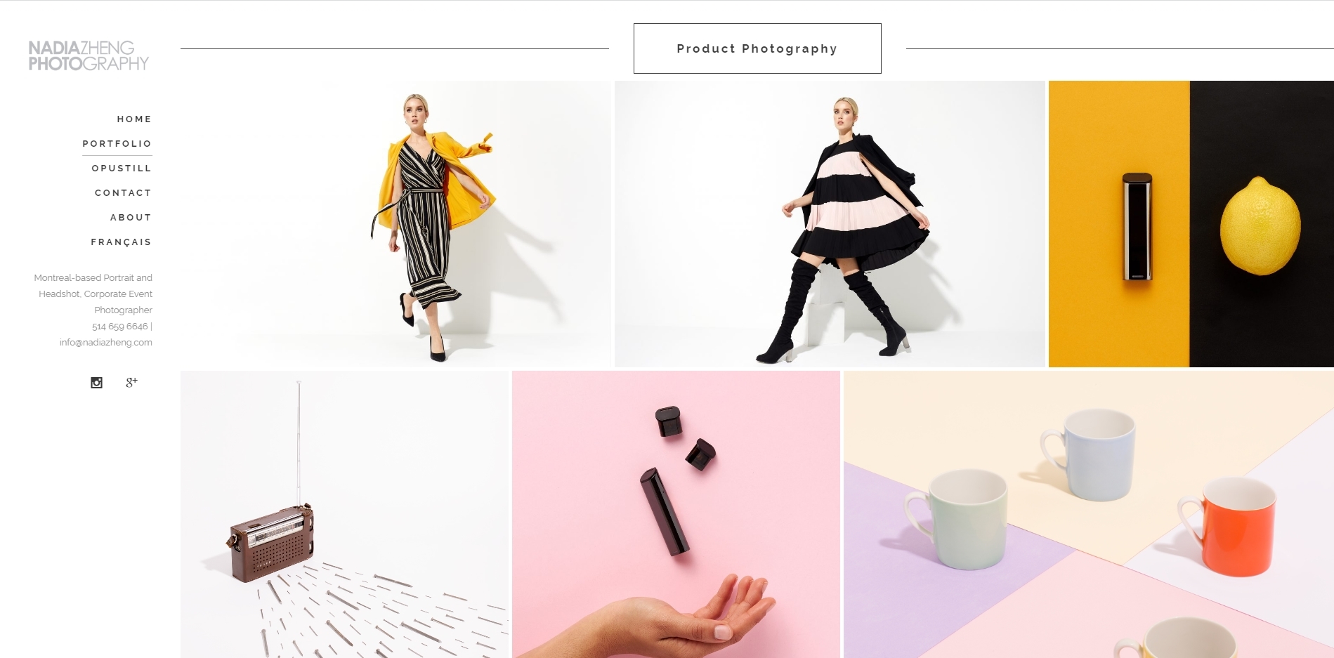
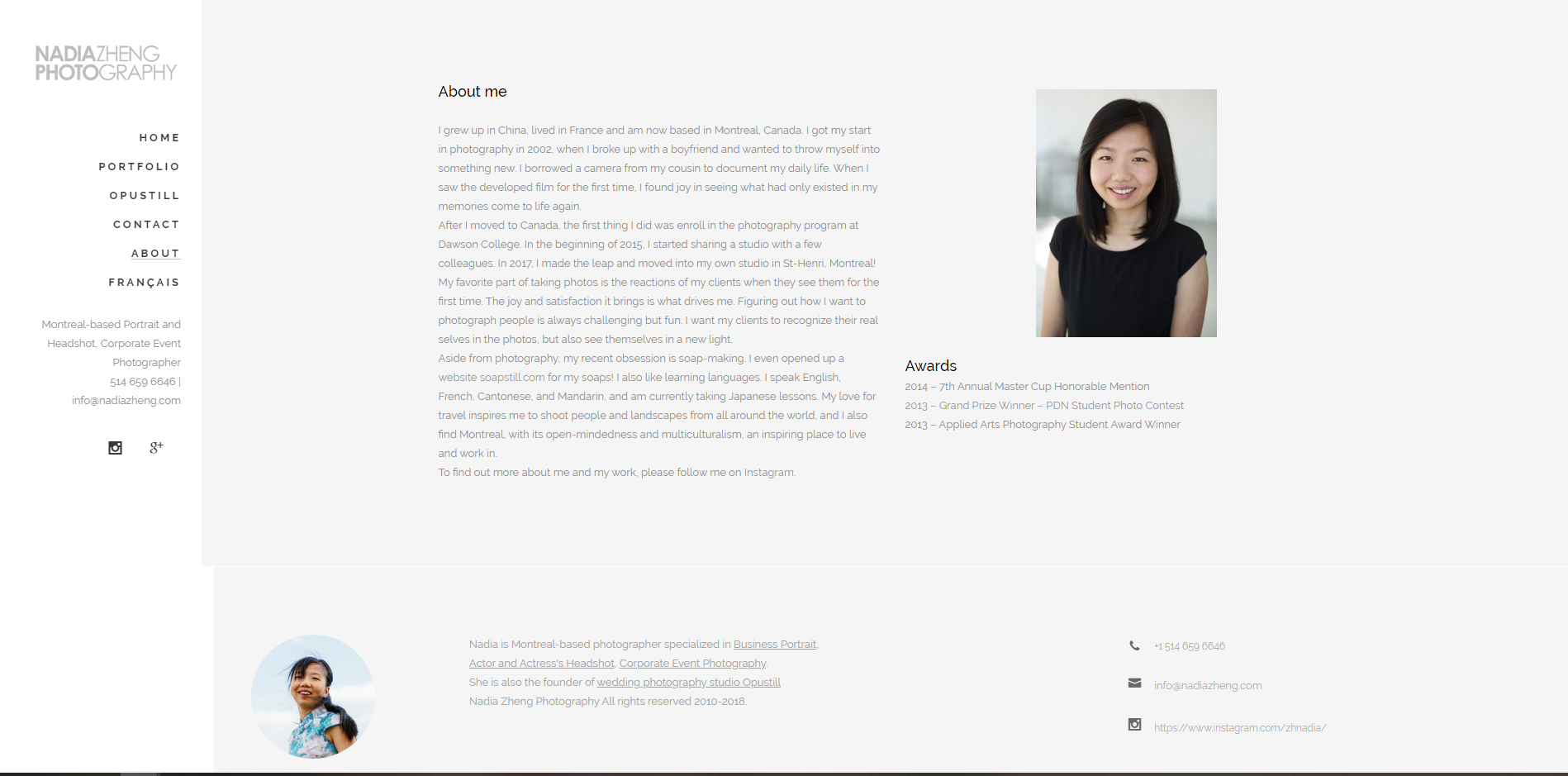
The design of the website is very clean, the left hand side of the website is dedicated to information and site navigation. The landing page is a slide show of Nadia's work and a very simple layout on the left with hyperlinks to navigate the site, which then open up and allow you to select what portfolios you'd like to see. Navigation is very easy, clicking on the categories doesnt take you to another page, it just reveals the right images for you to see
her logo is always at the top left of the page to see and the images are large and clicking on them makes them full screen. the typeface is always cohesive with the page in a very simple sans serif style.
http://www.ransommitchell.com/
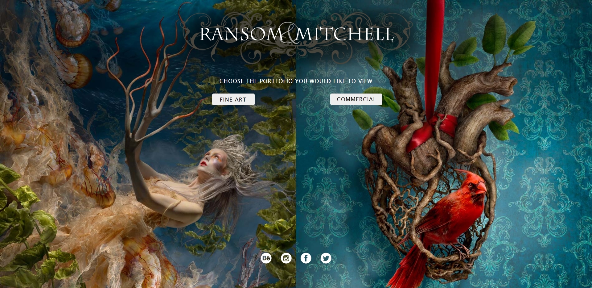
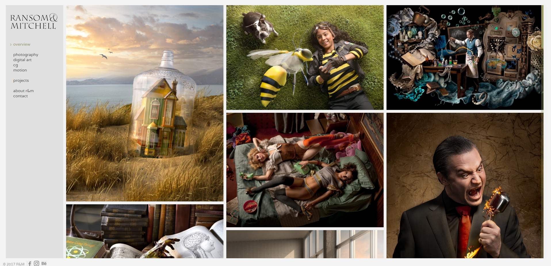
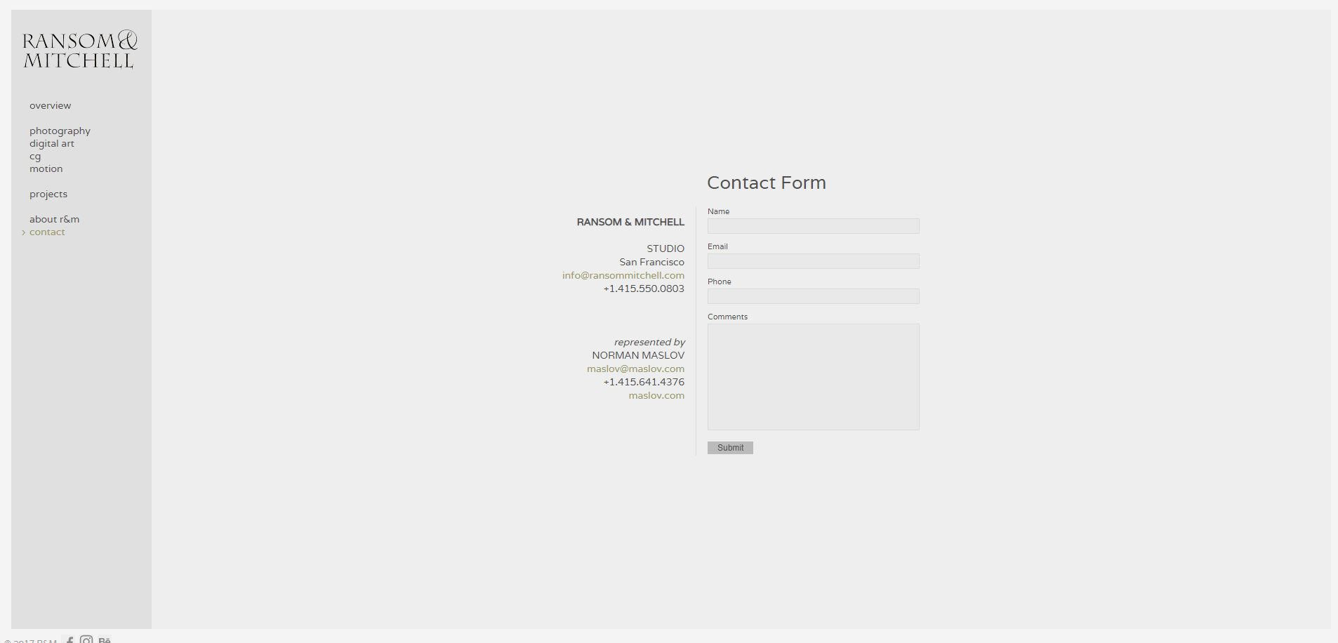
The landing page is a great setup, separating the different niche markets so that it's easier for someone who's looking for specific work to find what they need. From the landing page the rest of the website layout is very similar to Nadia's website, having photos on the page with info on a sliver to the left. The contact section of the page is super simple and easy to use with all the info needed to contact these photographers as well as a preset email form making it easy to email them.
https://www.timtadder.com/
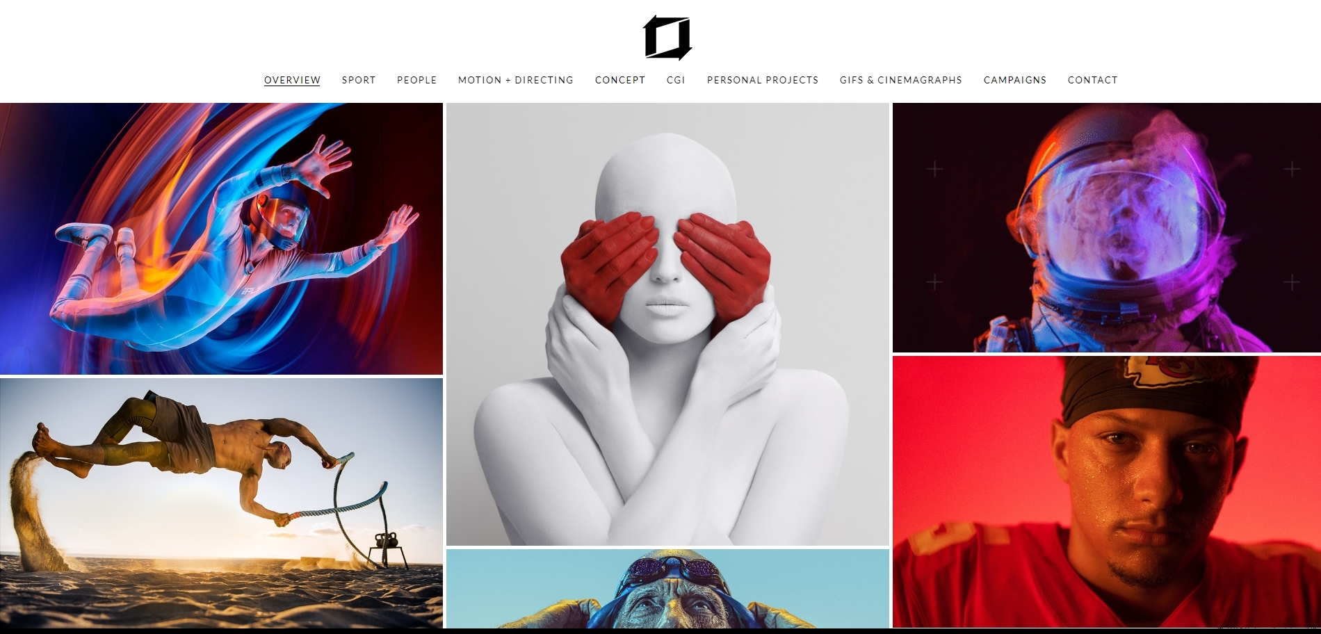
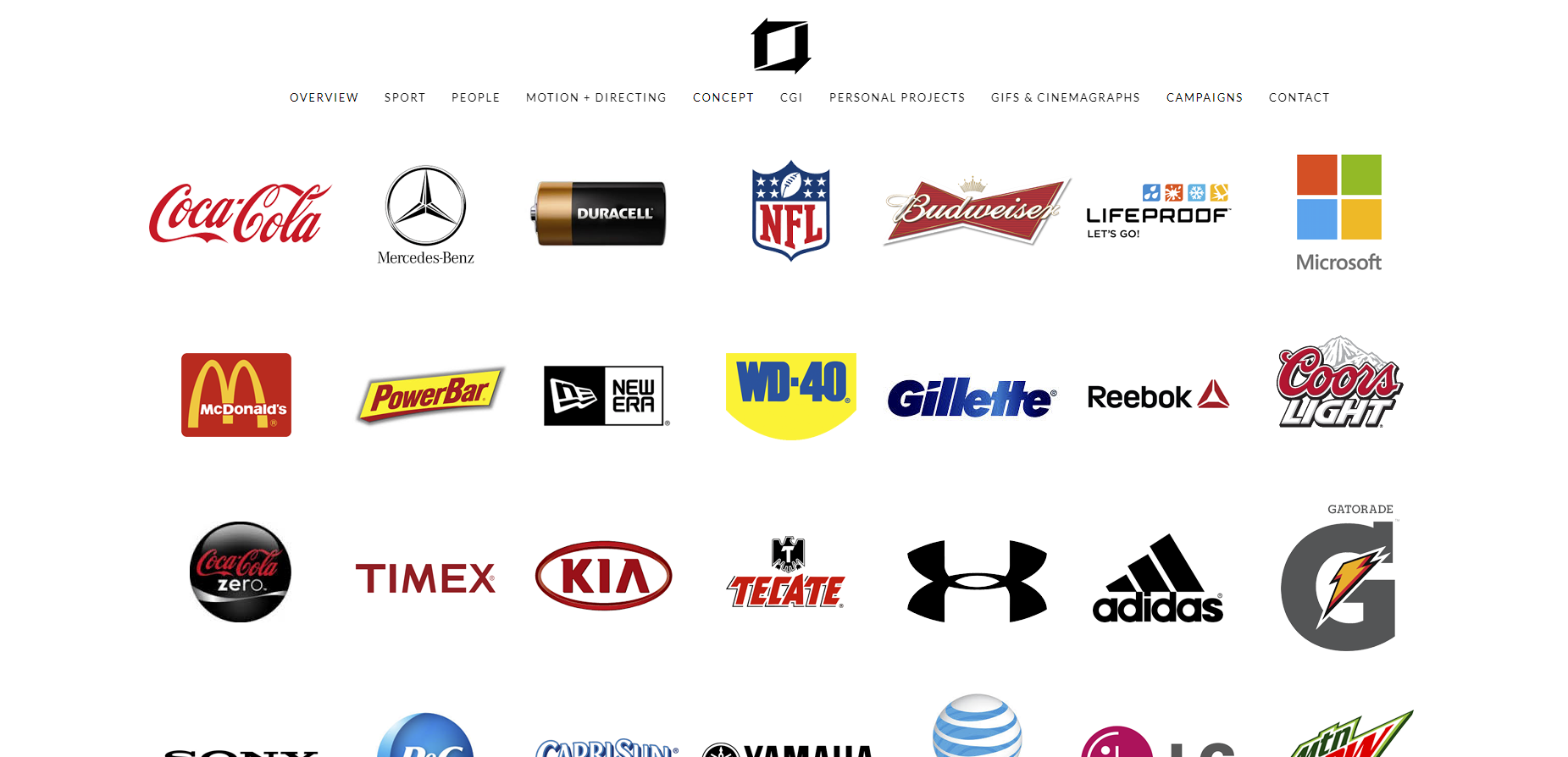
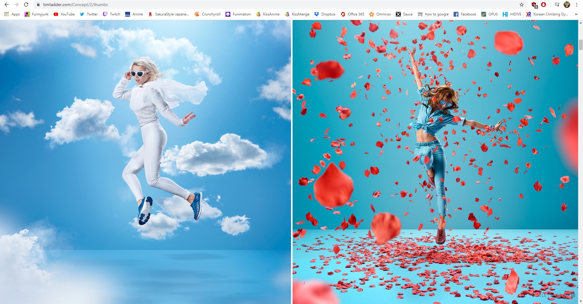
Tim Tadder's website takes a different approach than the other two with a top down layout, all the quick links and his logo are at the top of the page being quick and easy access for those looking for something specific right upon entering the website. Afterwords it's super simple to just scroll down and see all the work presented one after another. Usability of the website is great and gives you what you want to see quickly and efficiently.
From these websites I'd like to take the same approach of simplicity and usability. I want to have a very practical website that doesnt give people headaches while navigating through it. I really like having the info all in one easy and accessible place, like the left hand side and having the images quickly sort-able by category.
I would probably use Wix to make my website, it seems simple and easy to use and an affordable.
my domain would probably be victorahnroyerphoto.com as thats the name on my logo


The design of the website is very clean, the left hand side of the website is dedicated to information and site navigation. The landing page is a slide show of Nadia's work and a very simple layout on the left with hyperlinks to navigate the site, which then open up and allow you to select what portfolios you'd like to see. Navigation is very easy, clicking on the categories doesnt take you to another page, it just reveals the right images for you to see
her logo is always at the top left of the page to see and the images are large and clicking on them makes them full screen. the typeface is always cohesive with the page in a very simple sans serif style.
http://www.ransommitchell.com/


The landing page is a great setup, separating the different niche markets so that it's easier for someone who's looking for specific work to find what they need. From the landing page the rest of the website layout is very similar to Nadia's website, having photos on the page with info on a sliver to the left. The contact section of the page is super simple and easy to use with all the info needed to contact these photographers as well as a preset email form making it easy to email them.
https://www.timtadder.com/


Tim Tadder's website takes a different approach than the other two with a top down layout, all the quick links and his logo are at the top of the page being quick and easy access for those looking for something specific right upon entering the website. Afterwords it's super simple to just scroll down and see all the work presented one after another. Usability of the website is great and gives you what you want to see quickly and efficiently.
From these websites I'd like to take the same approach of simplicity and usability. I want to have a very practical website that doesnt give people headaches while navigating through it. I really like having the info all in one easy and accessible place, like the left hand side and having the images quickly sort-able by category.
I would probably use Wix to make my website, it seems simple and easy to use and an affordable.
my domain would probably be victorahnroyerphoto.com as thats the name on my logo

Comments
Post a Comment